Enabling Discord to generate new revenue based on native features.
Creating Server Boosting with Discord
What is Discord:
Discord (2015) is a popular, freemium chat app for friends and communities.
Context:
Discord looked towards scaling up very active end users—like large & growing, tight-knit communities—to expand on revenue opportunities.
Role:
Product Designer, design owner
Involvement:
End-to-end, 0 to 1, Desktop and Mobile platforms
Timeline:
about 9 months (2019-2020)
Results:
10% increase MRR (absolute) & promotion to Senior Product Designer 🤩
-
How might Discord provide benefits to active users who want to have an enhanced experience for their groups and communities?
-
How might Discord create an alternate, scalable source of revenue without relying on third-party partnerships or integrations?
Boosts enabled Discord to repackage and extend features like Partnered, Verified, and Nitro, offering access to these functionalities to all other Discord users through a community-building approach.
-
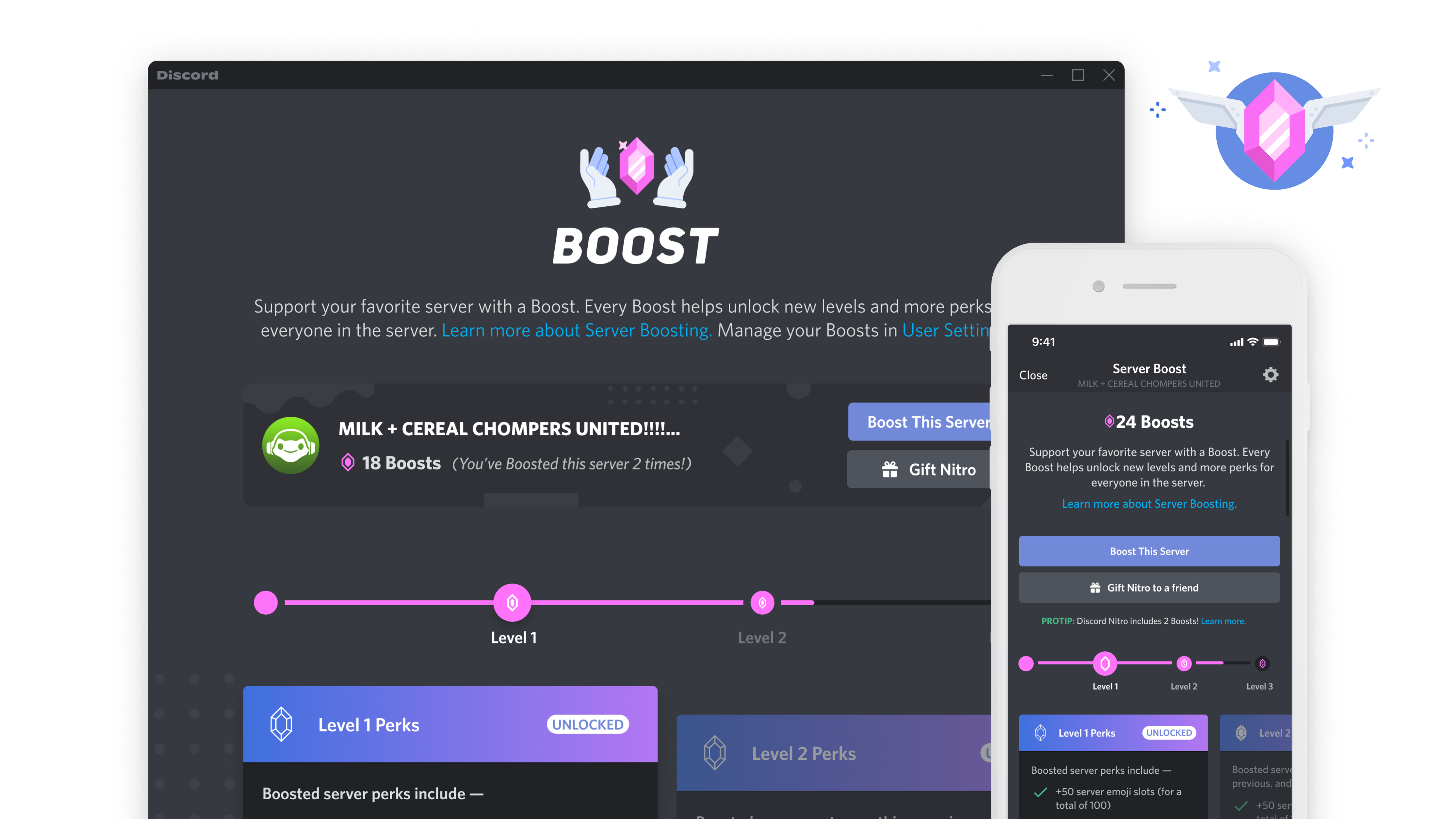
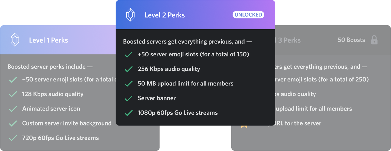
Identify the rewards for using this feature.
Since we wanted to rely on our proprietary features, we derived those perks from existing premium services within Discord.
-
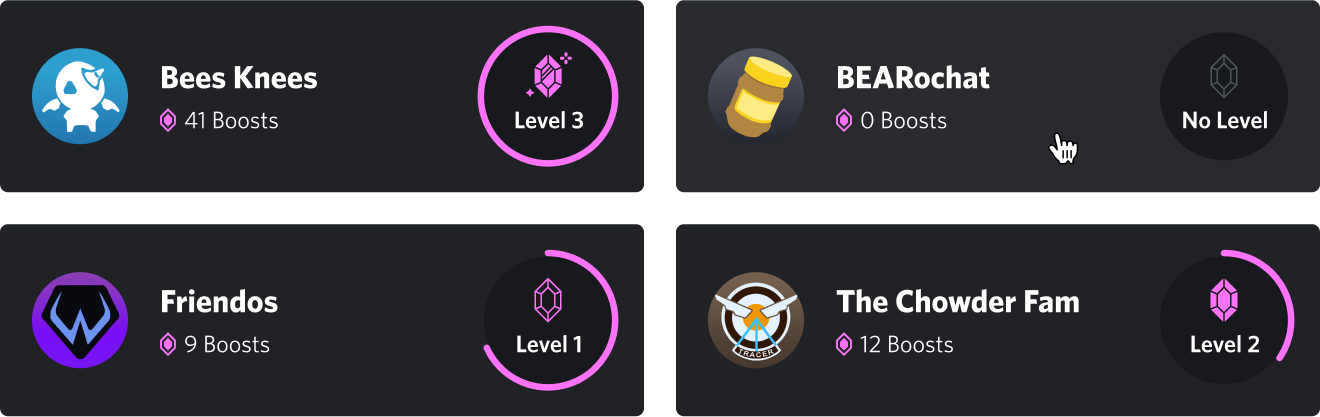
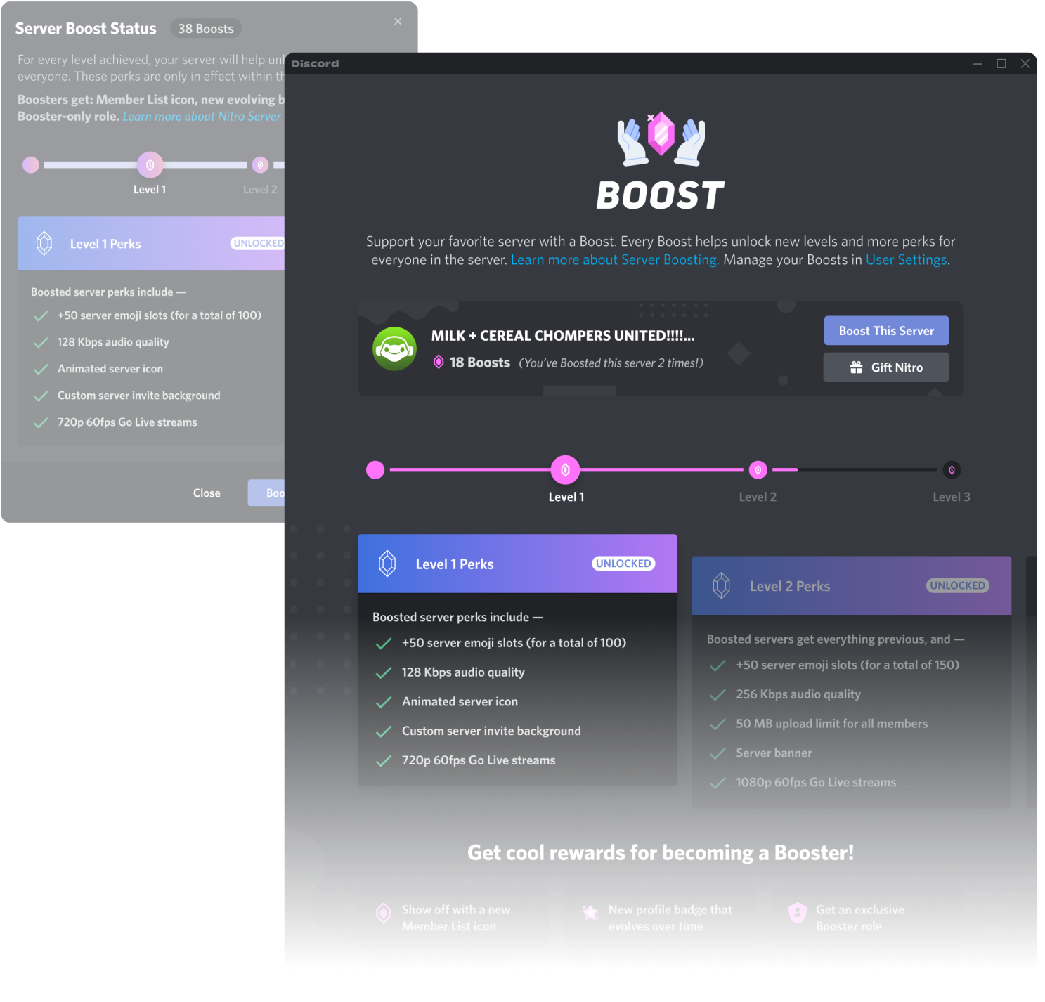
Group perks by increasing order of value & focus on clarity.
This framework was set up to be scalable, so that future projects could add on different features to these Levels.
-
Work with our artists to create a positive brand and make it synonymous with “community supporter.”
Creating a brand around this new feature was paramount—developing a consistent visual representation would help identify Boosting actions across the app.
Shoutout to Binh Hoang, Elie Dagher, and Justin Middendorp for working on various Boosting elements with me.
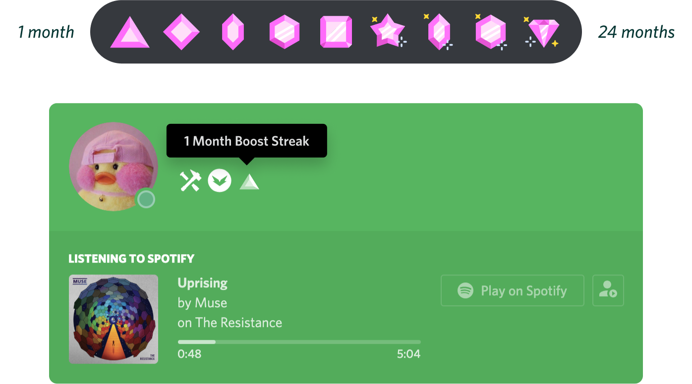
To emphasize a user’s Boost commitment to a community, we conceptualized a profile badge that would evolve after a few months. Badges are rare collectible icons that appear on your Discord profile.
-
Identify entry points.
I reused existing styles badges that indicated Partnered and Verified servers and applied Boost branding—the badge itself was an entry point into the Boosting surface.
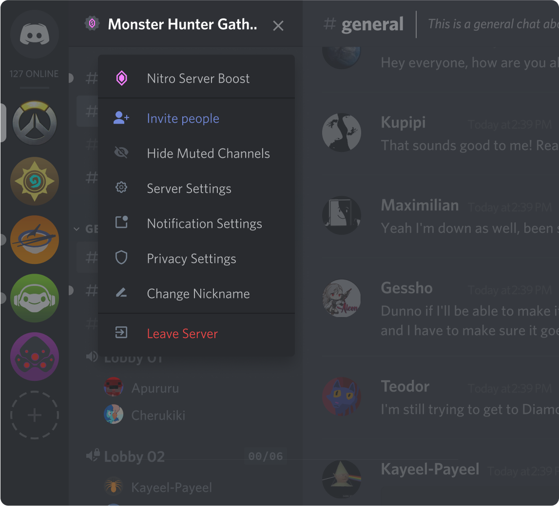
Feedback from our users said they felt more comfortable having a more discreet entry point like this rather than an entry point on the surface with the main chat area (this is where our users have most of their attention on).
Additionally, when a member Boosts a community, the system broadcasts this within the community, motivating others to join in on the activity or feature (including an entry point).
A Booster is given a pink gem icon in the members list as an additional entry point.
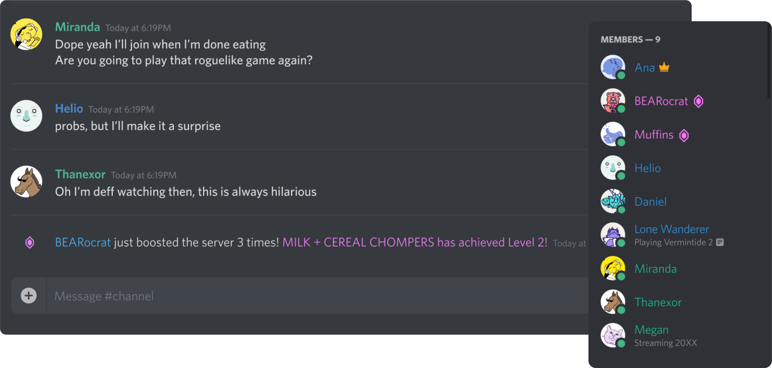
We used different messaging to target our main audience:
- If a user visited a server more often, we would encourage them to Boost the server.
- When Boosting first launched, we sent messaging out to server owners to learn more about the feature and encourage their members to Boost the server.
- Reminders to servers that had expiring Boosts and would lose benefits.
The Challenges.
-
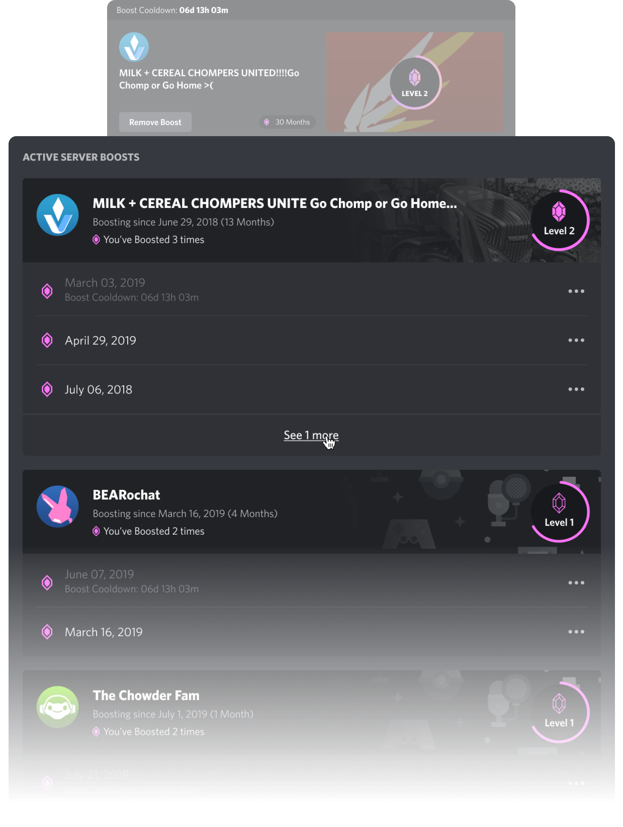
Initial success increased complexity: MVP was a single Boost per person. The second iteration allowed for multiple Boosts to multiple community servers.
I decided to start by changing how a user could manage Boosts associated with various communities:
- List servers visually. Text is secondary.
- Each line item needed allows a second line of messaging for errors, time-sensitive information, etc.
- Add in menus for each line item for various actions like transfers and cancellations.
There were a few things I changed on the main action surface; I collaborated with our engineers to iterate on it:
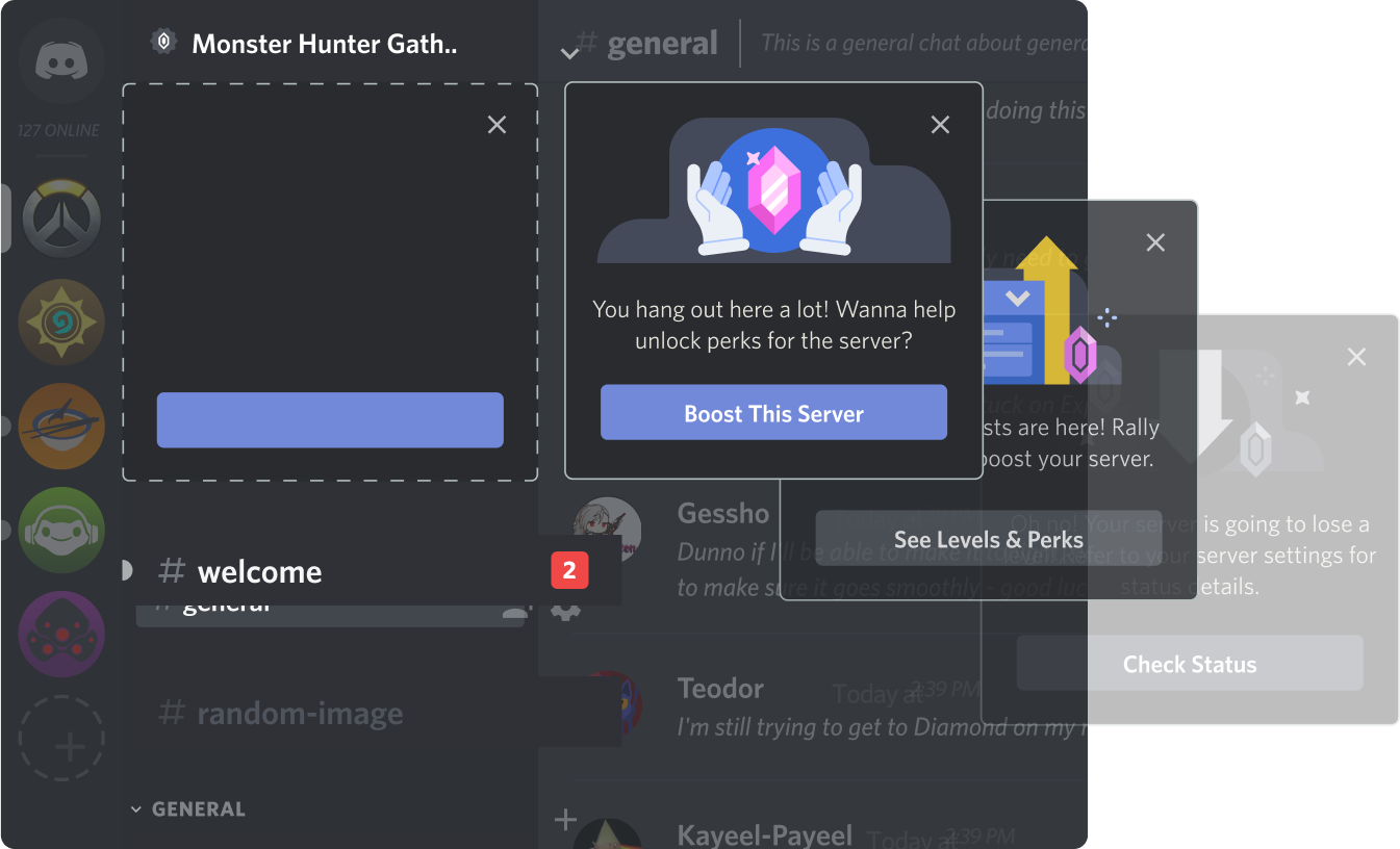
- After the feature’s initial success as MVP, I decided to make the main Boosting surface larger so that we could display more relative information and marketing.
- I included information like the server icon and server name so that the user could more easily identify where their Boosting was going to.
- Giving things more space and chunking information out made this surface more scannable.
-
Convince stakeholders to advocate for good user experience.
Major workflows like Boosting subscription management restricted users to less predictable basic actions. I identified the problem and presented it to my team members (and subsequently, stakeholders) to open the conversation, moving us towards a better direction together.
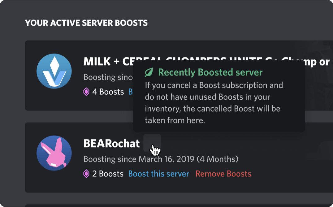
In the case above, the user would have to jump through mental hoops to cancel a Boost subscription, which meant it was not easy to use or intuitive.
-
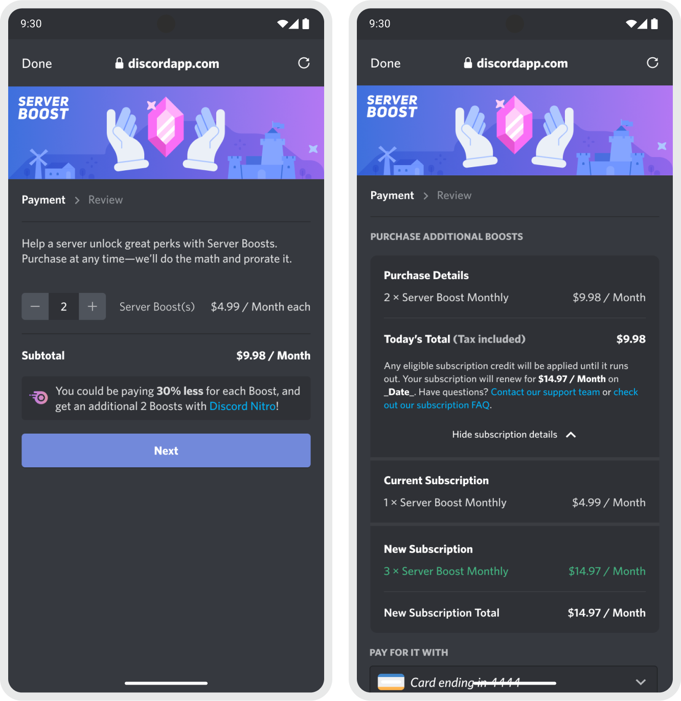
We designed and built entirely new billing and invoice flows in order to support Boosting subscriptions.
I designed new invoice screens with support from fellow product designer Karen Foligno. These invoice screens were completely new, and had to include clarifying information for pricing and totals.
- Multiple different subscription sums or differences.
- Accomodate redeeming subscription credits.
- The same invoice style was reused for other purchase actions, like subscription cancellation or upgrading.
Retrospective
I volunteered for this project early in my career at Discord to make a significant impact. Now, as a more experienced designer, I can identify mistakes and offer strategies to address them:
Show, don’t tell.
Create a variety of iterations that are completely different. In addition, prototype key iterations to really bring home a social-focused premium revenue feature.
Conduct usability tests early and often.
Reach out to other employees for low-cost, quick feedback much earlier in the process.
Additional iterations on the marketing page as Growth and Revenue initiatives.
Reduce information density, chunk content into more scannable groupings.
Don’t be scared to make the Boosting feature more visible.
A common balancing act for B2C products is “how do we ask users to buy something?” Instead of hiding behind a menu, make it a part of the main UI, and evolve the feature into a community-building strategy.
The Team
- Supratik Lahiri Product Manager
- Sharon Coone Product Marketing Manager
- Byron Young Engineering Manager
- John Furrow Engineering
- Michael Peterson Engineering
- Paul Shen Engineering
- Zack Zapasnik Engineering
- Jeff Cailteux Engineering
- Max Friedman Engineering
- Sam Garfield Data Science
- Binh Hoang Artist
- Elie Dagher Artist
- Justin Middendorp Artist
- Jay Torres UX Writer