Helping Discord become WCAG AA compliant, and establishing guidance on future branding.
Working with the Discord Accessibility team (2021-2022)
What is Discord:
Discord (2015) is a popular, freemium chat app for friends and communities.
Context:
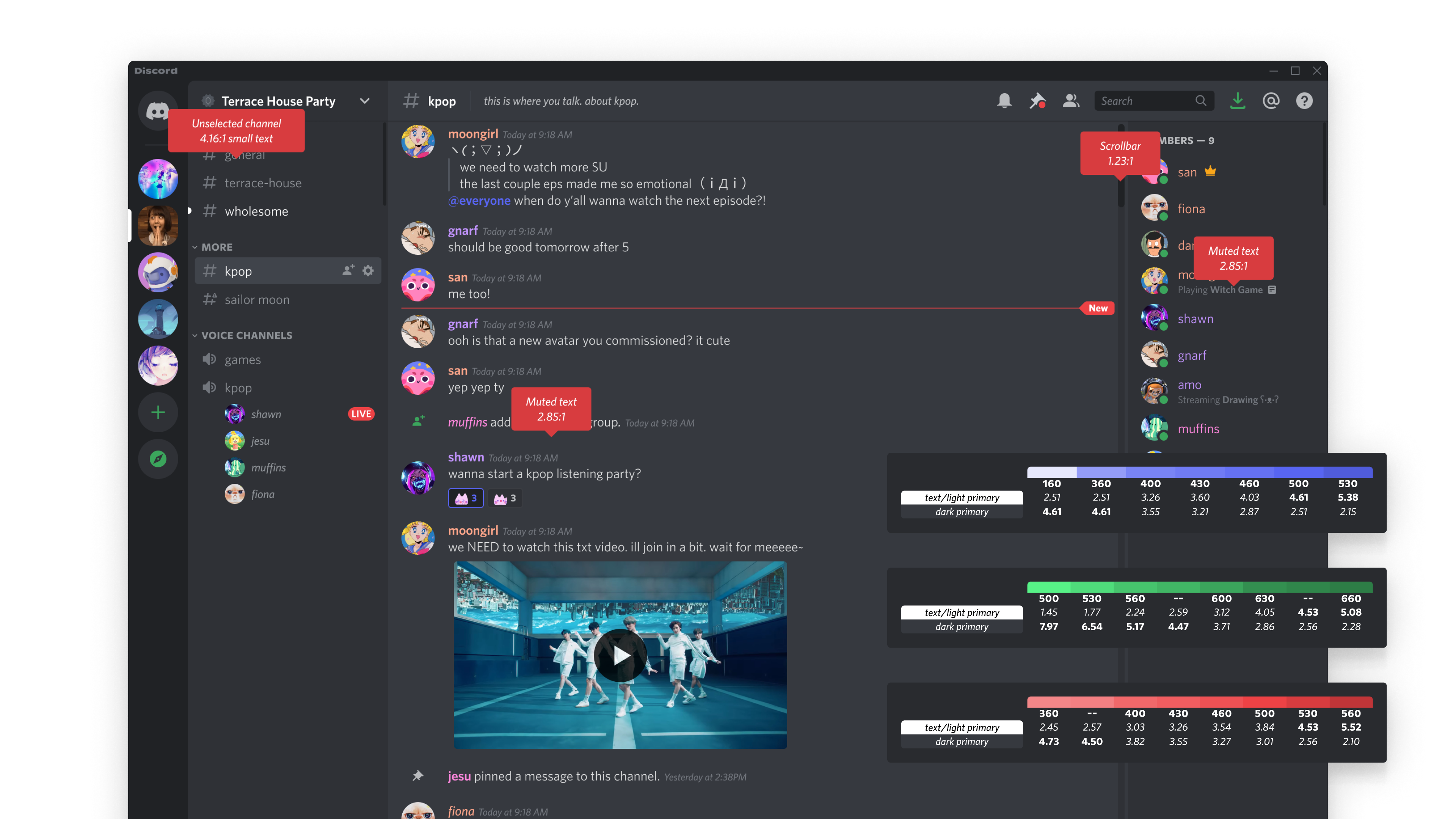
Discord had a generally distinct visual identity in regards to the user interface style. However, things like color contrast fell by the wayside as the product began to develop and bloom.
Role:
Product Designer
Involvement:
Auditing and design, Desktop and Mobile platforms
Timeline:
4-5 months (2021-2022)
Results:
Shipped! With neutral to positive sentiment.
-
How might Discord provide a better experience to all users, especially users with visual disabilities?
-
Discord must achieve WCAG AA compliance by a target deadline.
We brought together a small and mighty team to help reinterpret the existing visual styles into a modernized, contrast-compliant color system. Getting early buy-in from leadership and a public initiative with the American Council for the Blind helped expedite much of the conversation.
-
Become okay with impacting 100% of users, for really good reasons.
Working on something like this was an amazing opportunity and also a daunting one. As a B2C company, it was easy to fall into the trap of subjective feedback anxiety. Receiving positive feedback from a diverse user base and recognizing that this would lead to a general improvement overall helped calm the nerves.
-
Work with engineering and audit the entire app.
We needed a definitive look at what needed to be updated. So, with the help of the engineers we collected all the places that had rogue color variables and generally poor contrast. This includes background colors, text on top of those colors, light and dark themes, and understanding how they’re used together.
-
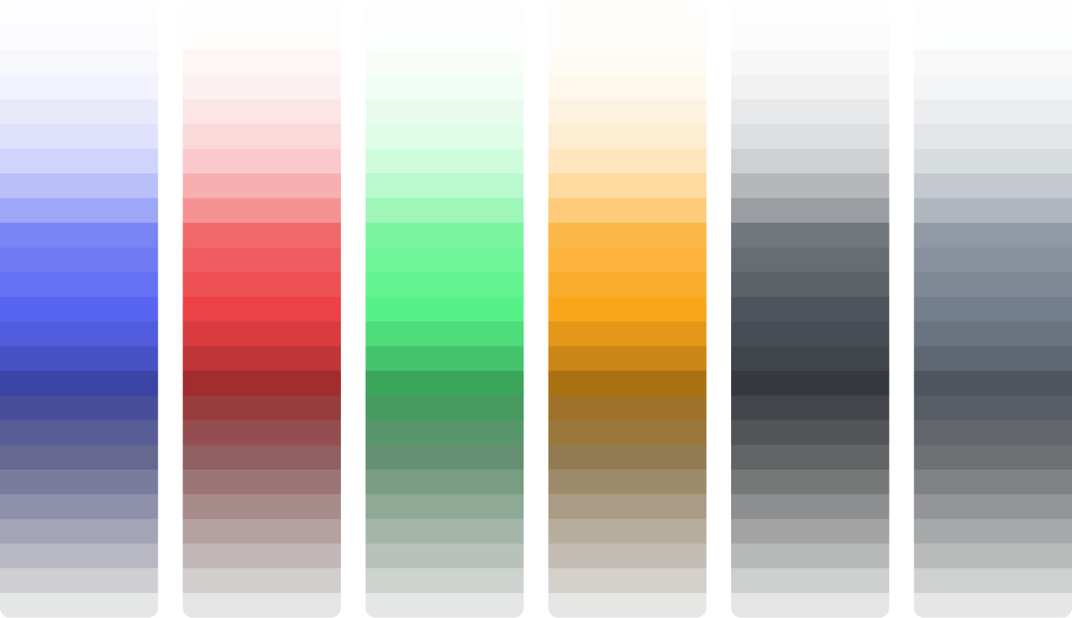
Understand available color libraries and scope the project.
Luckily for us, we had a library of colors to choose from. This accelerated most of our work; the palette was previously created from a programmatically calculated color palette.
-
Get close and personal with the WCAG requirements.
I learned a lot about color contrast ratios and how to gauge when to use specific rulesets. While most of the guidelines are straightforward, Discord as an app is complex and required some specific interpretations of rules.
The Challenges.
-
Interpret and, when necessary, reinterpret the Web Content Accessibility Guidelines as best we can.
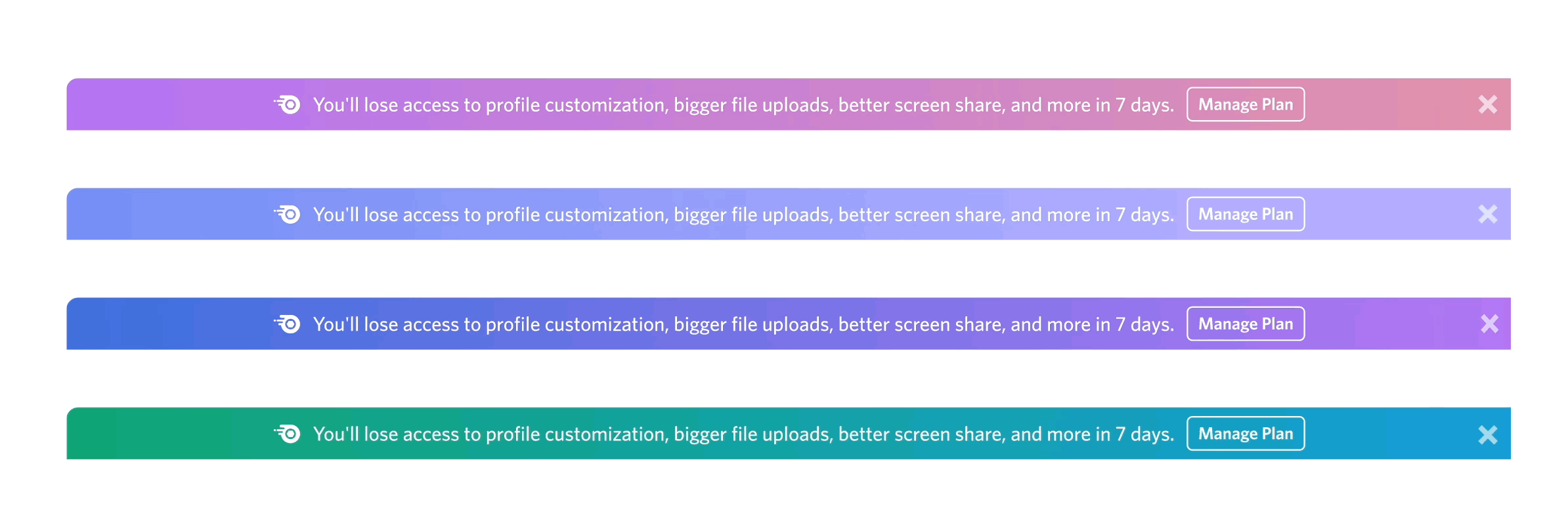
For example: the message bar in Discord is technically always active (you can press any alphanumeric key and it will type in the input). Is it meant to be in a disabled state or active state? Should the typing indicator be active? Increase the text contrast or increase the background color contrast to a certain ratio?
The final solution was to increase text contrast, and not include a typing indicator (to keep the original intent of the feature).
-
Get buy-in from the product design team.
I gave mini presentations, updates in our chats, and shared context with feedback. Everyone was generally on-board with updating the design system color contrasts, and we had healthy debates on how to redesign certain components in order to fit these colors without diminishing the visual bar.
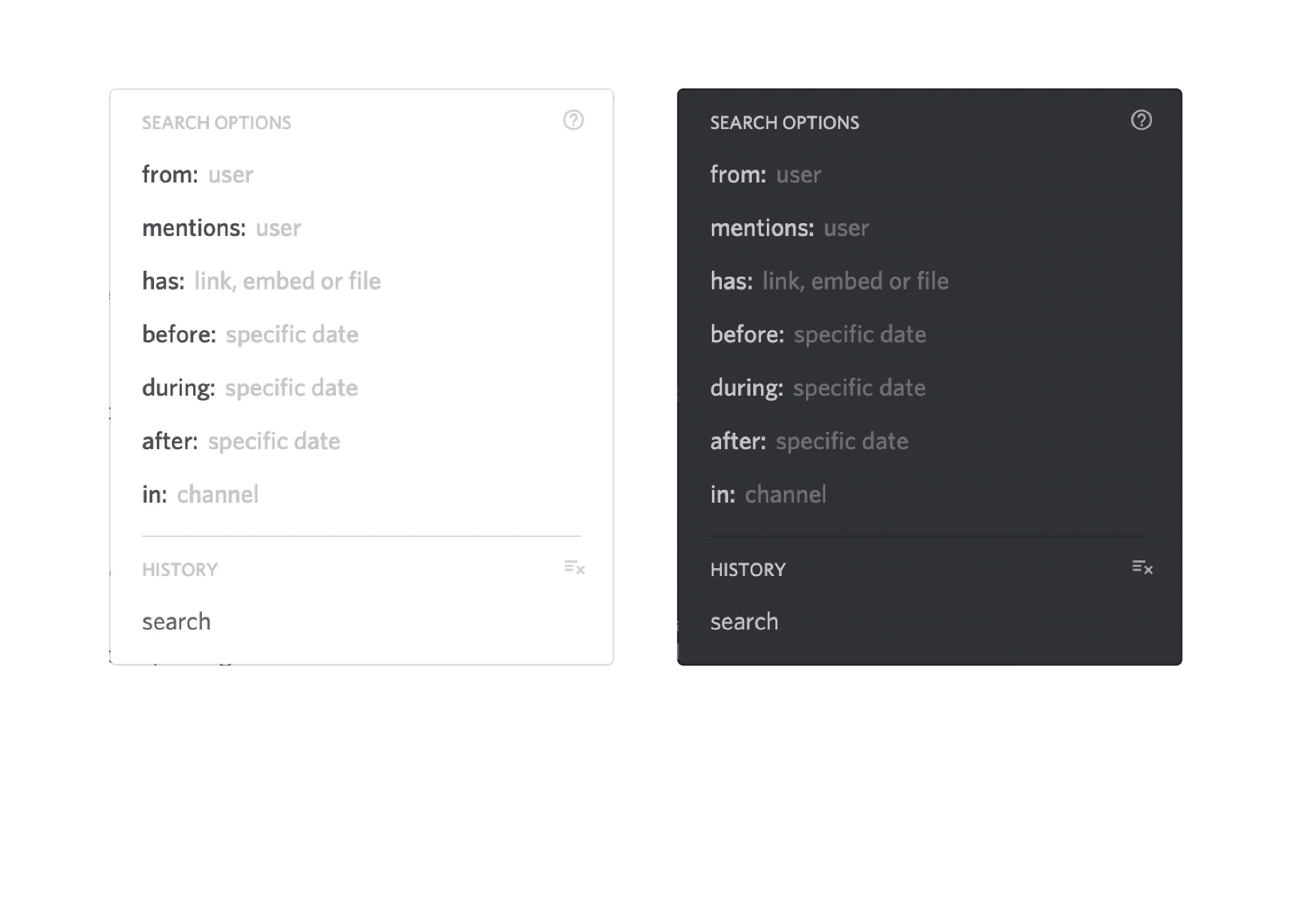
I shared a Figma file with the before and after component changes which helped visualize the changes. The design team would then leave feedback if something didn’t feel right and I would be able to respond or reassess my decision-making.
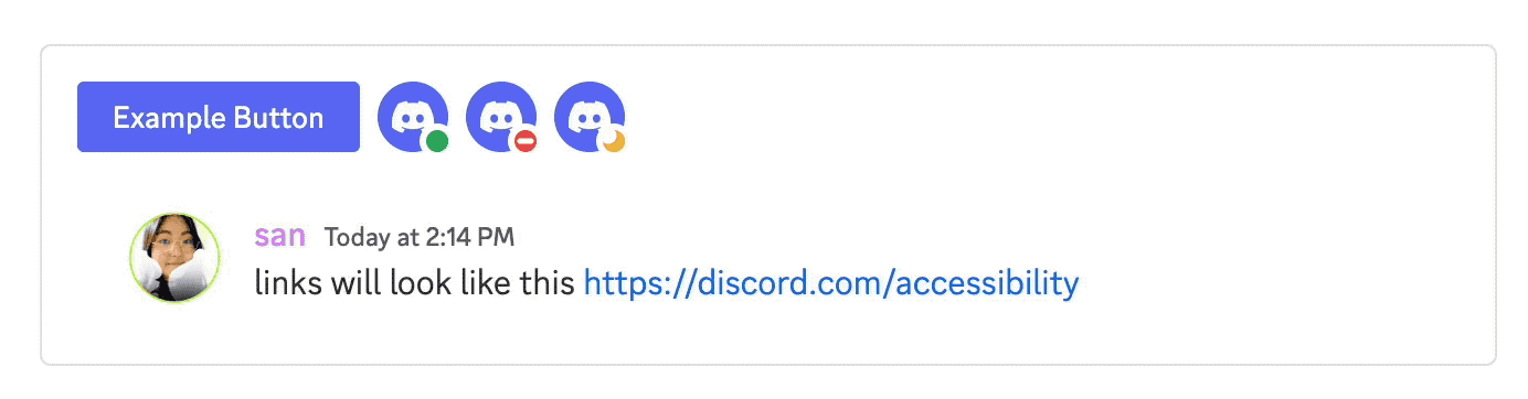
I worked with multiple departments, one most notably the Revenue product design and marketing teams. These conversations were accelerated with our collaboration with Discord Art Director Amo Zhou. The changes were minimal but required changes across multiple marketing surfaces in order to accomplish our goals. I helped our graphics teams understand the WCAG requirements and how to measure contrast with gradients, a basis for Discord’s premium branding.
-
Gather feedback directly from accessibility users.
The team had a separate chat where we could speak to users directly and it was extremely helpful. This feedback was leveraged in most of our decision-making when building for these features. The team continued to collaborate with this group for future a11y features.
My only regret is that I didn’t get to save any of the feedback—the group was extremely helpful in guidance and setting a direction.
Other accomplishments.
-
We tried to capture as many rogue components as possible.
Naturally, there was a lot of “legacy” to capture and redesign into a more visually accessible version. Working on this project enabled engineering to update those old components as they burned down the task list.
-
Working on accessibility initiatives lead to creating an Accessibility settings page.
While creating a new settings page is not that remarkable in itself, this addition enabled scalable solutions that could be housed in this page and easier to find.
- I contributed by adding in example UI that would appear at the top. For any visual changes in the accessibility page, the user would be able to see what those changes looked like for common UI elements.
- Color saturation settings were developed by our engineers so that users with high contrast sensitivities could feel more comfortable.
- Role colors are user-generated—I proposed the option to separate the color from the text, which helped maintain legibility of text regardless of which theme was in use.
- Reduced Motion was included, making the app more subtle for users with animation sensitivities. From then on, for every project that had major animations and interactions, Reduced Motion must be considered.
Retrospective
This project was an amazing additon to my experience—working with wonderful, empathetic team members and creating such an positive impactfuul result made it all worth the while. Looking back, I would have liked to improve some things for myself if I were to do something like this again:Attempt to be more organized.
A lot of the work had to do with scanning surfaces and deciding what to change. This meant Google Sheets with decisions, CSS changes, and links to various frames and artboards in Figma. It would have been better to work much closer to what engineers were using like an Asana board.
Meet people half-way.
I could have been much more clear about design decisions; familiarizing myself with our CSS variables and programmatic structure would have helped communicate these decisions more efficiently. Displaying changes more openly within the organization might have facilitated discussions and prompted me to consider how to communicate the changes to a broader audience.
The Team
- Joey Baker Engineering Manager
- Jon Egeland Engineering
- Brandon Dail Engineering